Details
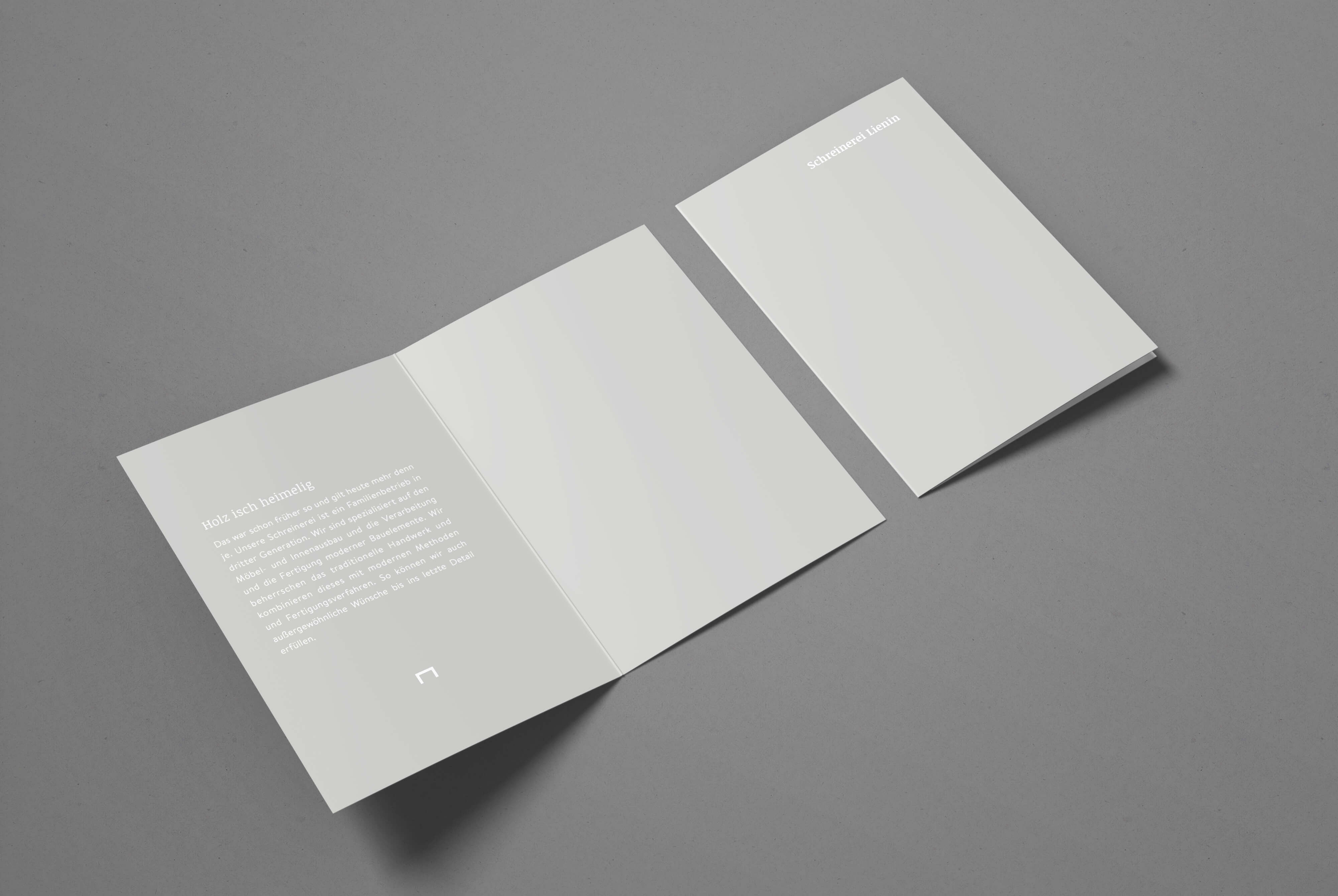
Holz isch heimelig
Third generation, new direction: For Lienin Carpentry, a family-run workshop near the Swiss border, we developed a brand identity that reflects the company’s shift – from traditional craftsmanship to a fresh, design-forward mindset.
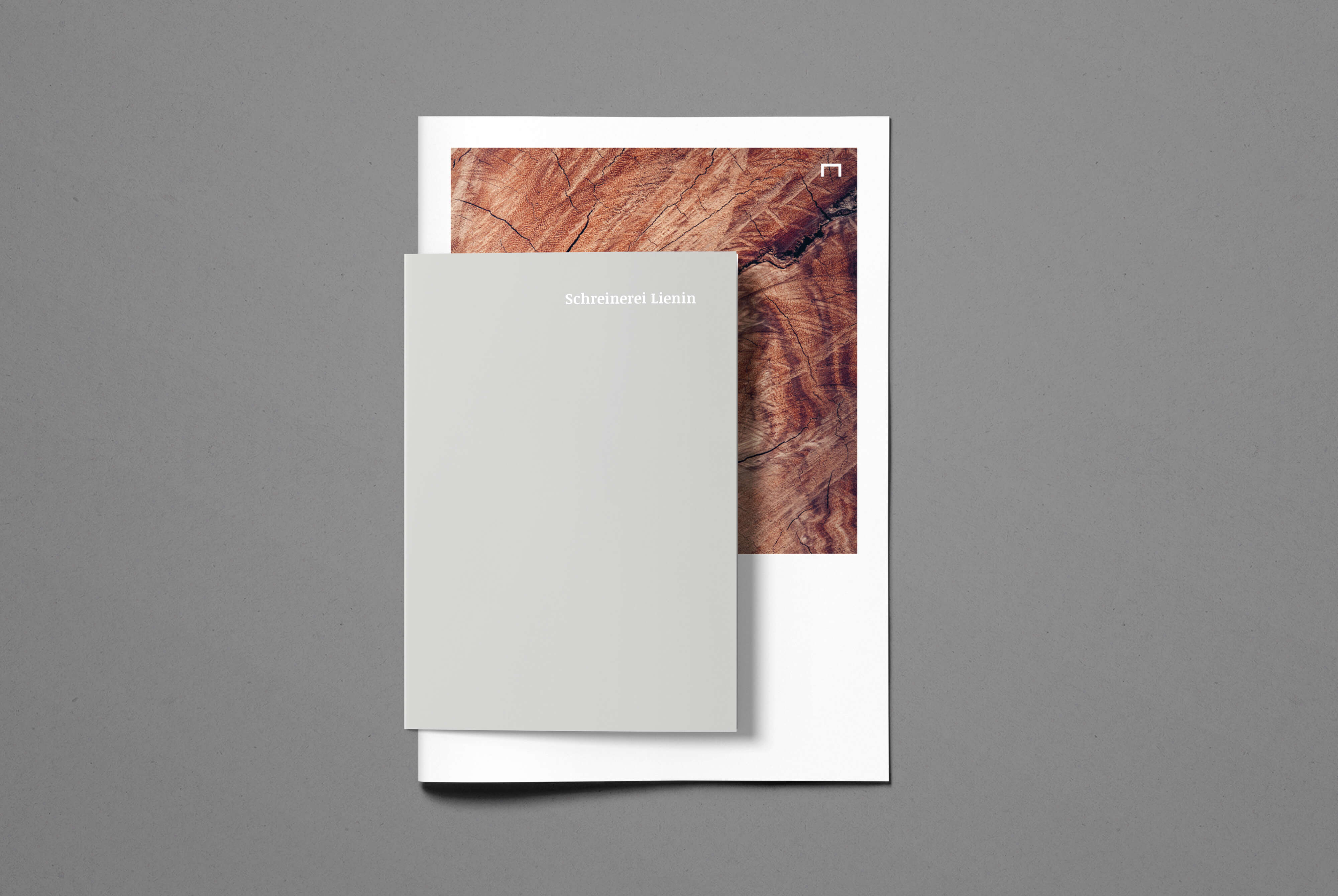
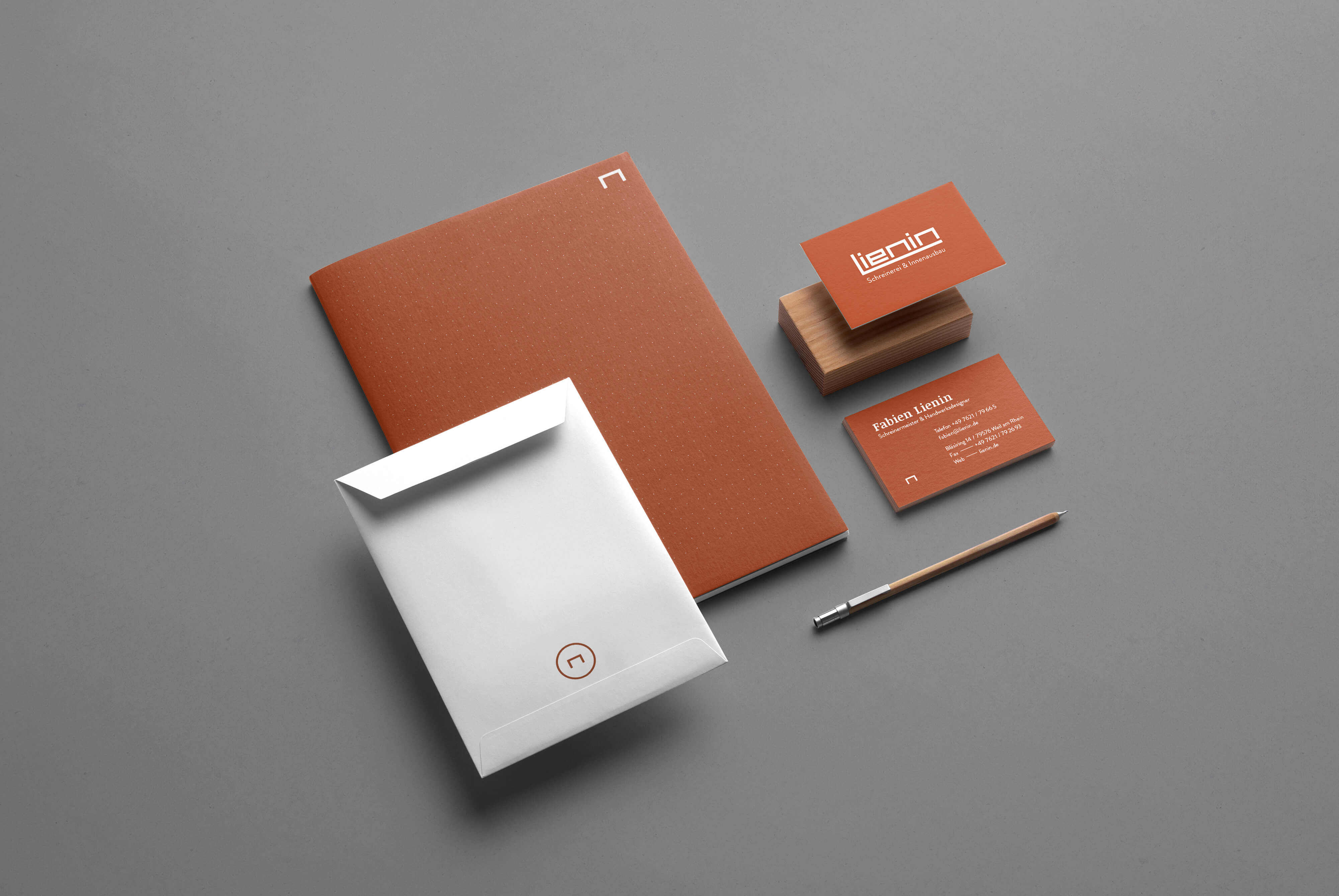
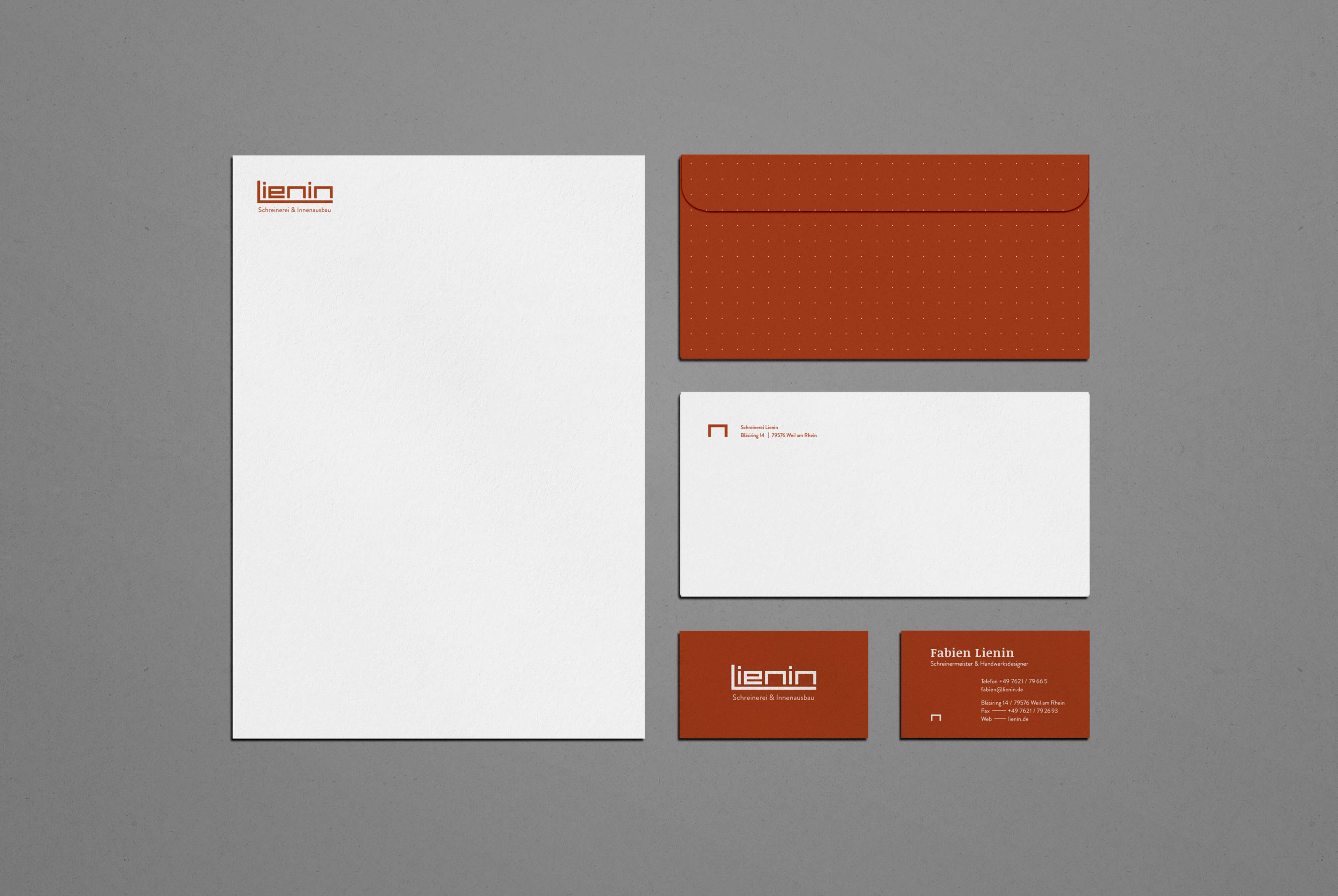
The new look thrives on contrast: modern sans-serif typography for body copy meets a classic serif headline – creating a blend of heritage and clarity. The logo was simplified and refined: the “M” – resembling a table – becomes the brand’s visual anchor.
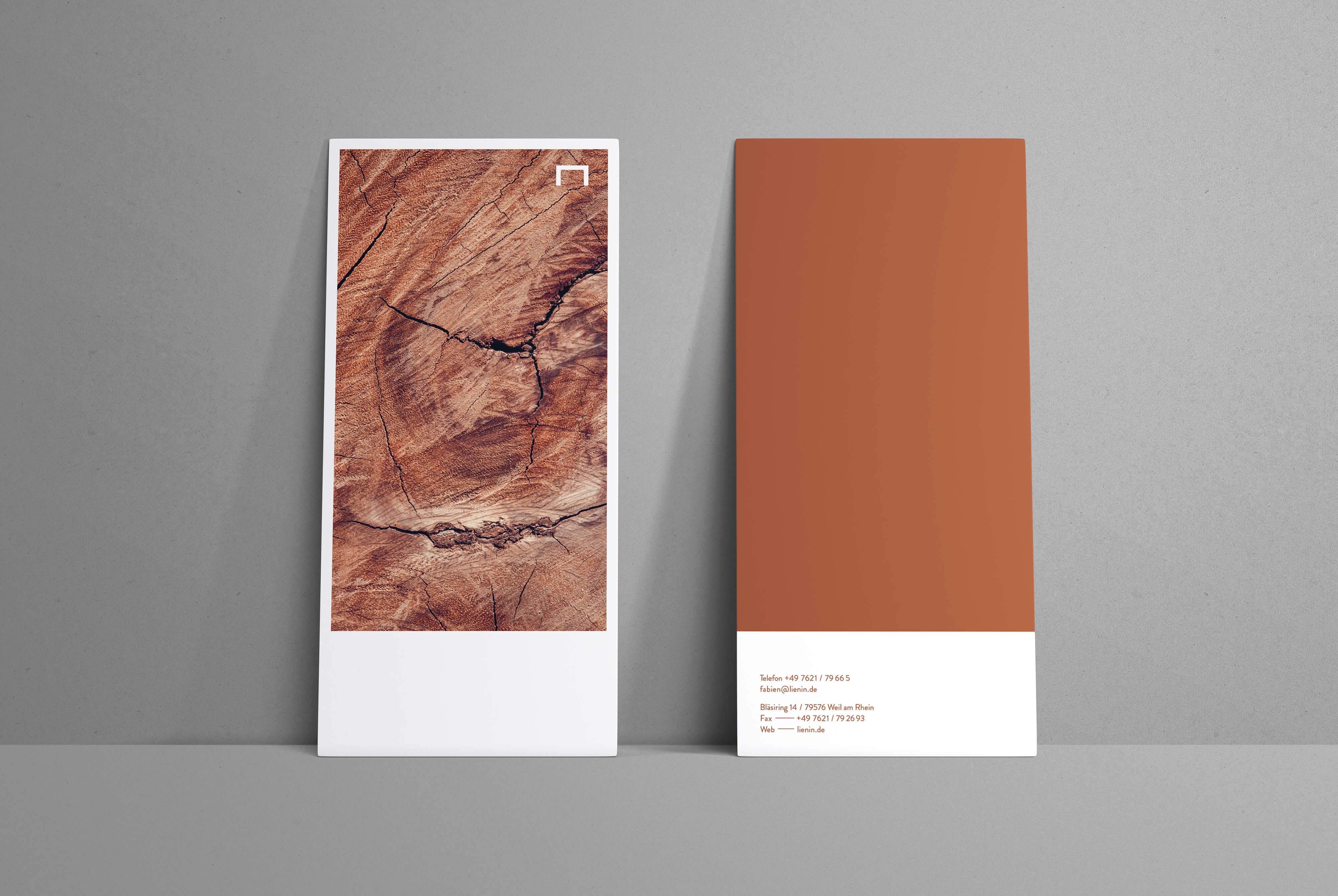
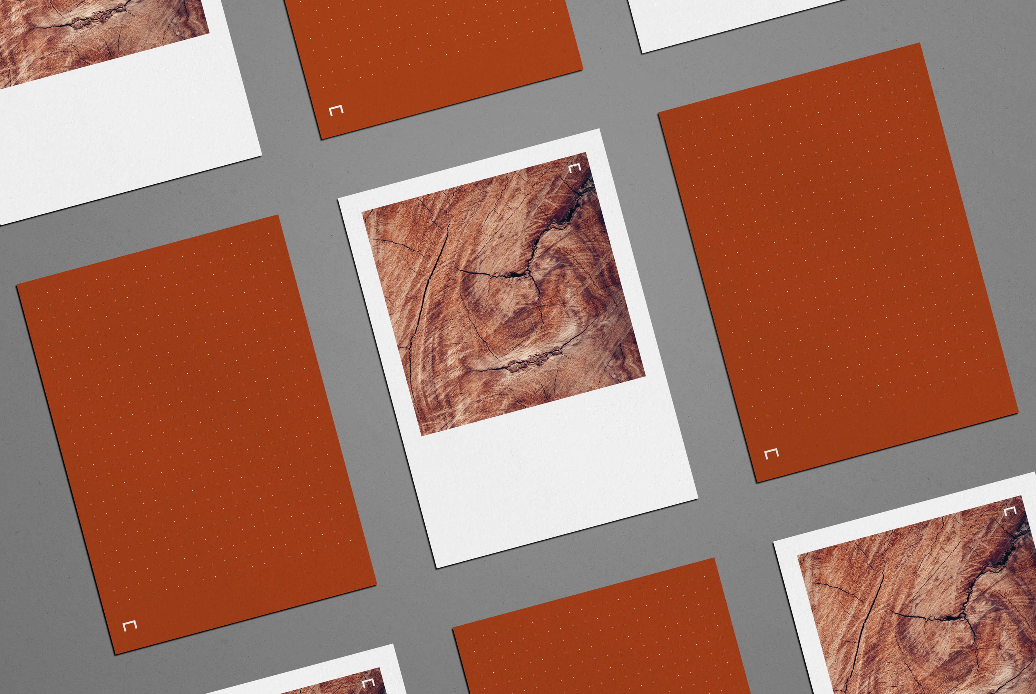
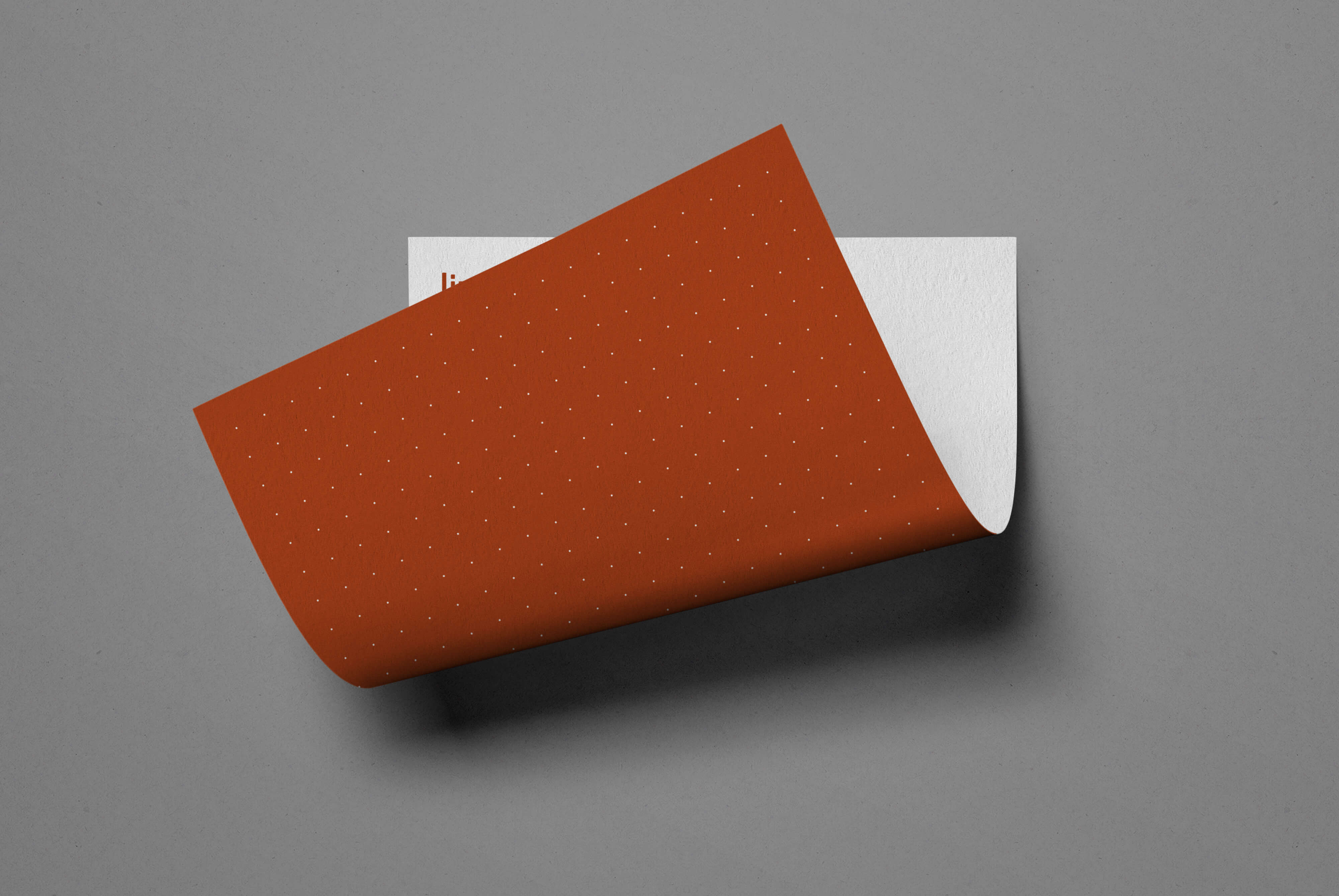
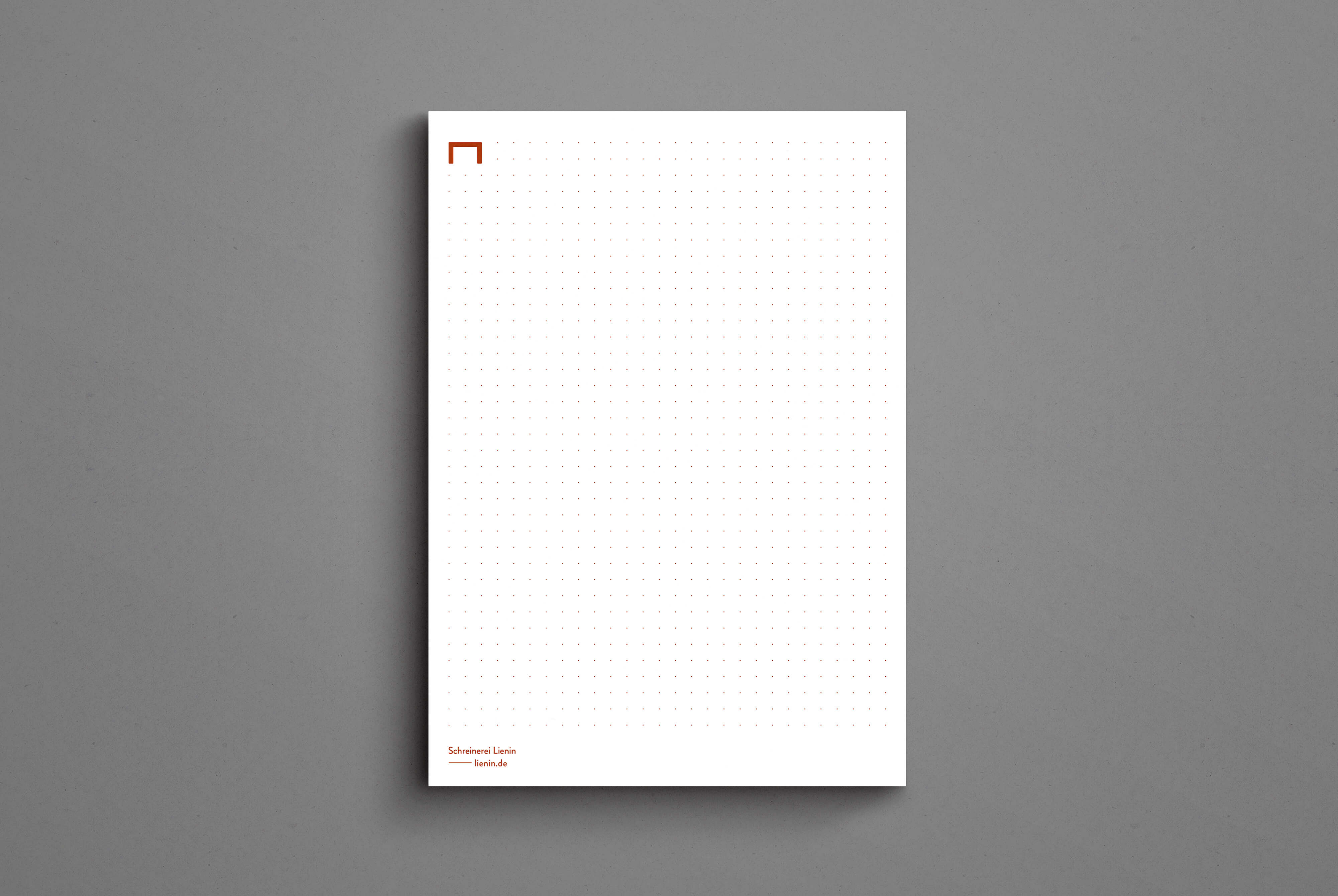
The color scheme is rooted in the material: a warm brown, somewhere between walnut and cherrywood, paired with soft greys and generous white space. As a subtle reference to the design process, we introduced a dotted grid system – like a scaled drafting sheet – into stationery elements such as notepads and folders.
The project included a full logo redesign, corporate identity, and UX/UI design for the new website – modern, minimal, and firmly grounded in craftsmanship.
Tasks
Brand Design
UX / UI Design
