Details
Reduced. Refined. Recognisable.
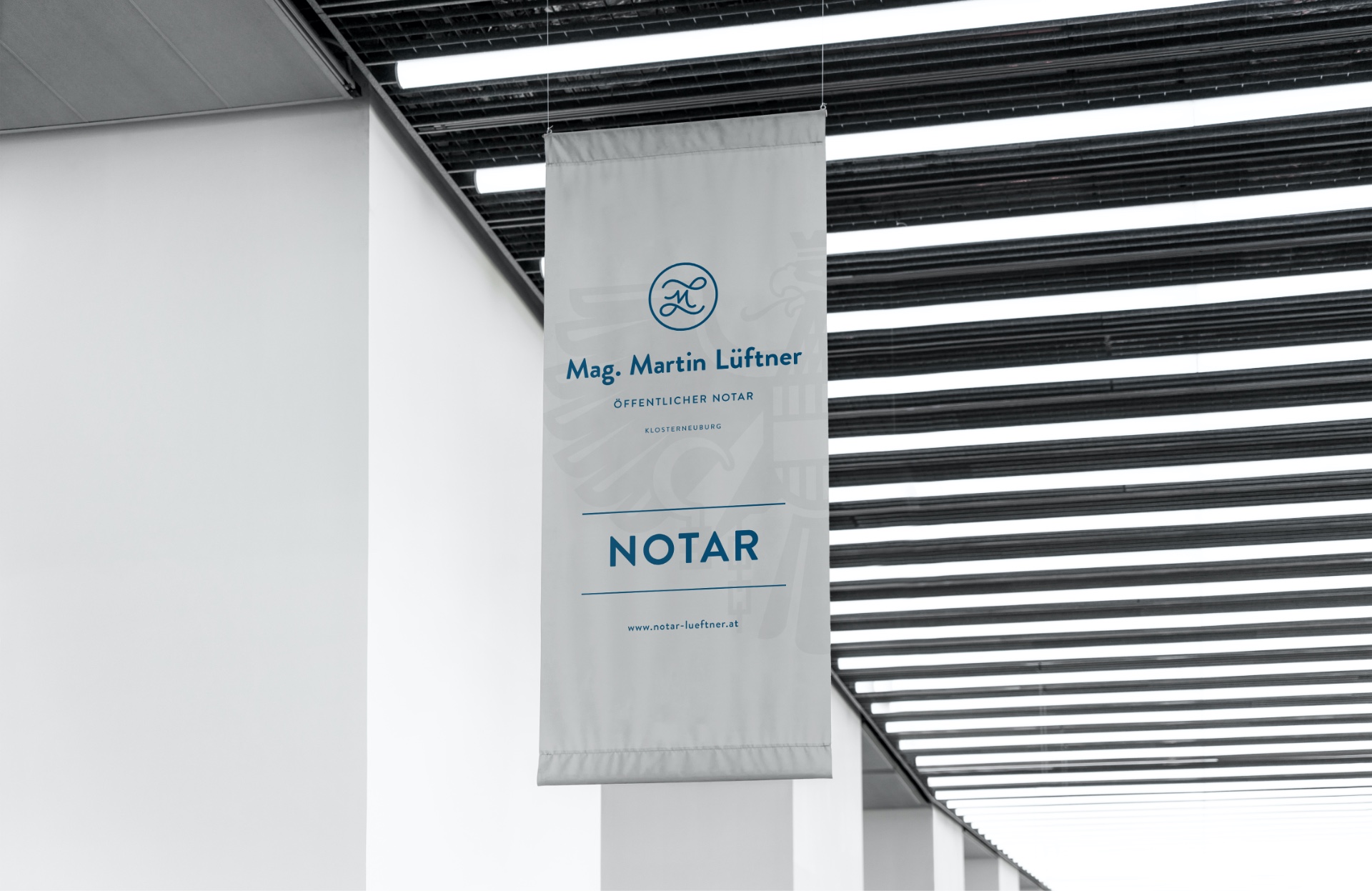
Serious, modern, and full of quiet confidence: For notary Martin Lüftner, we developed a visual identity that bridges classic authority with contemporary clarity. The goal: a brand presence that doesn’t shout but stands firm – minimalist in form, impactful in impression.
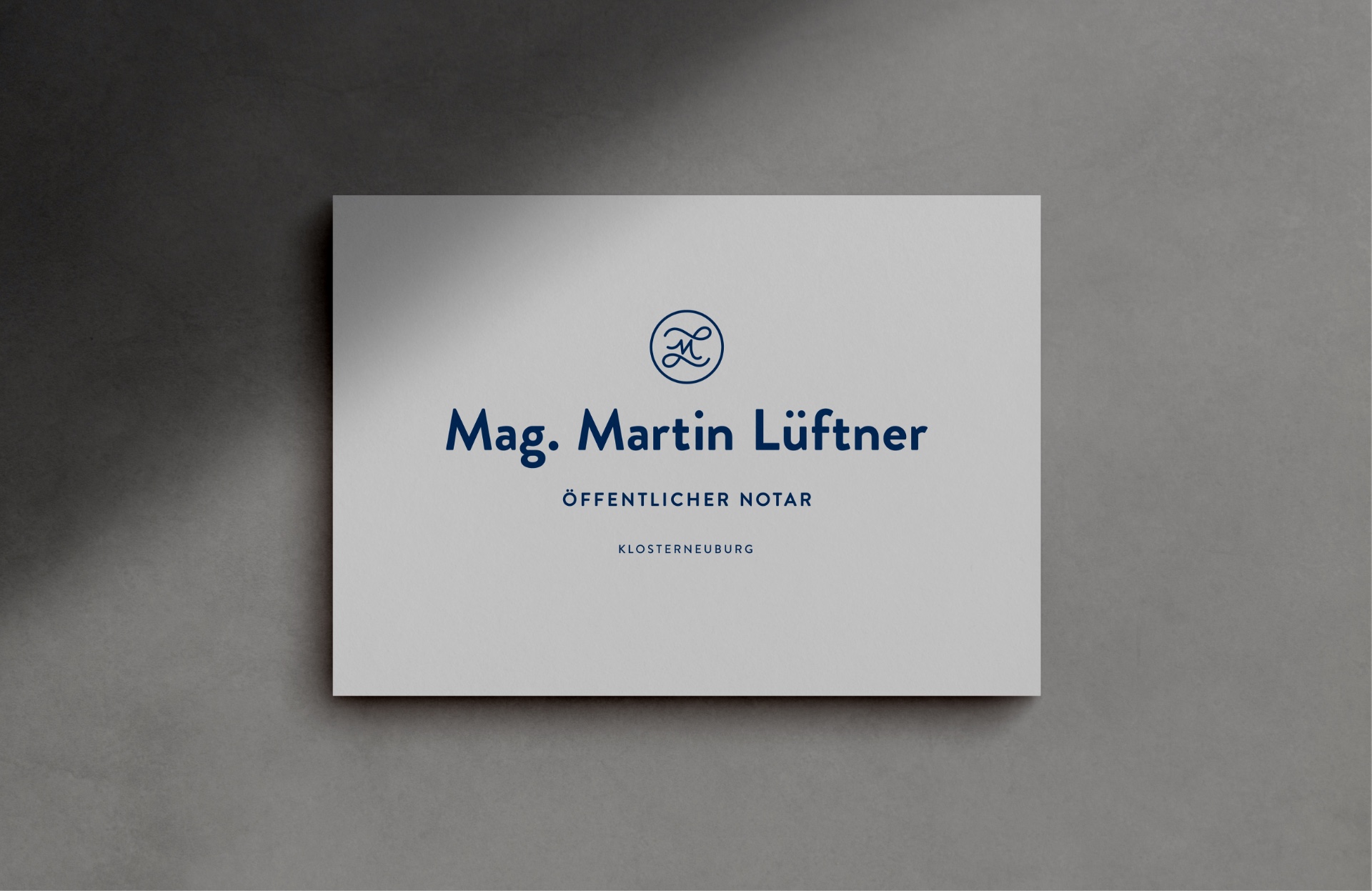
The logo translates the initials into a graphic signet, reminiscent of a traditional seal ring. It nods to official symbolism while functioning as a crisp, modern mark. The entire design sits at the intersection of heritage and reduction – a balance of law and design, of legacy and present.
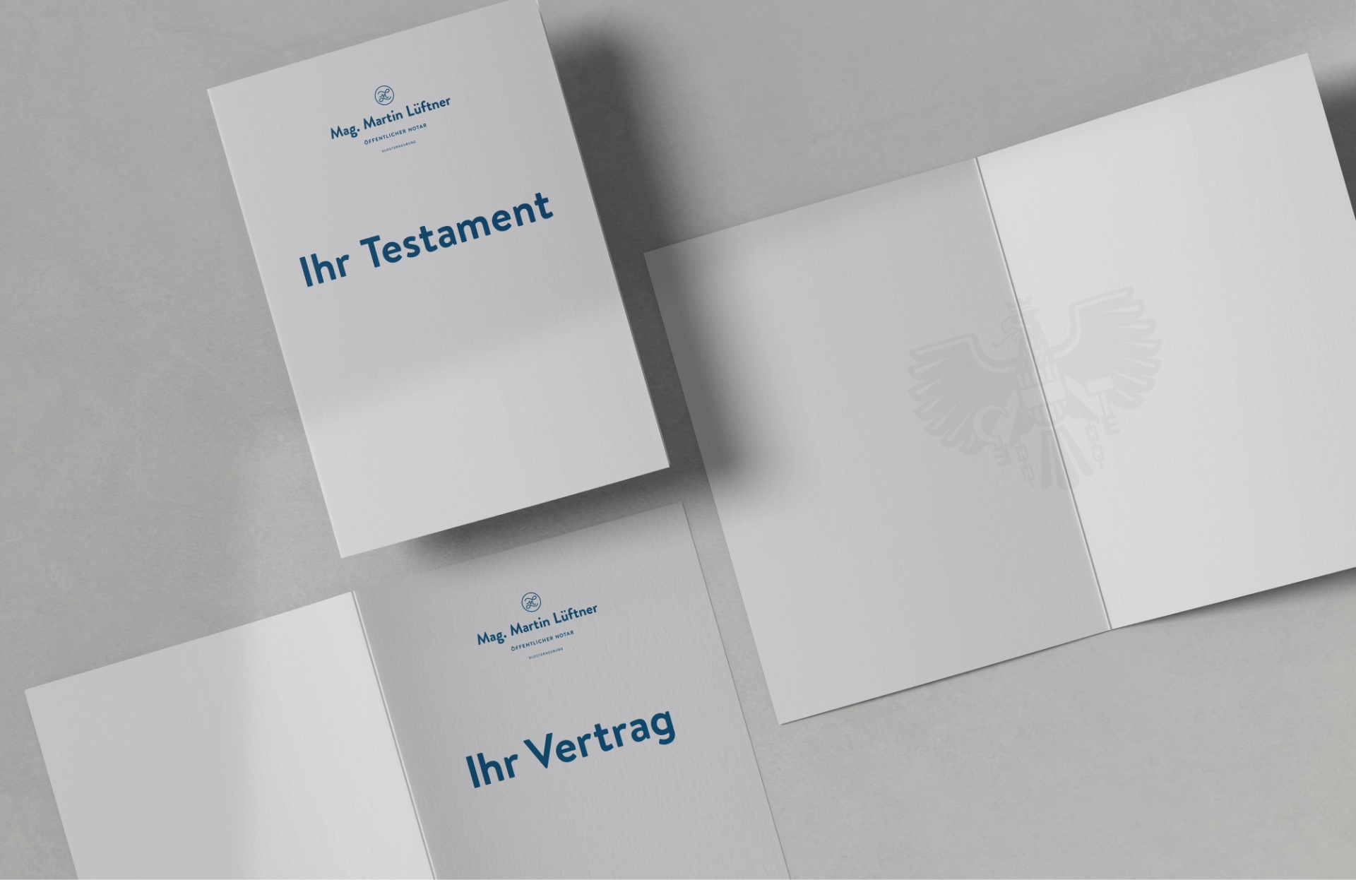
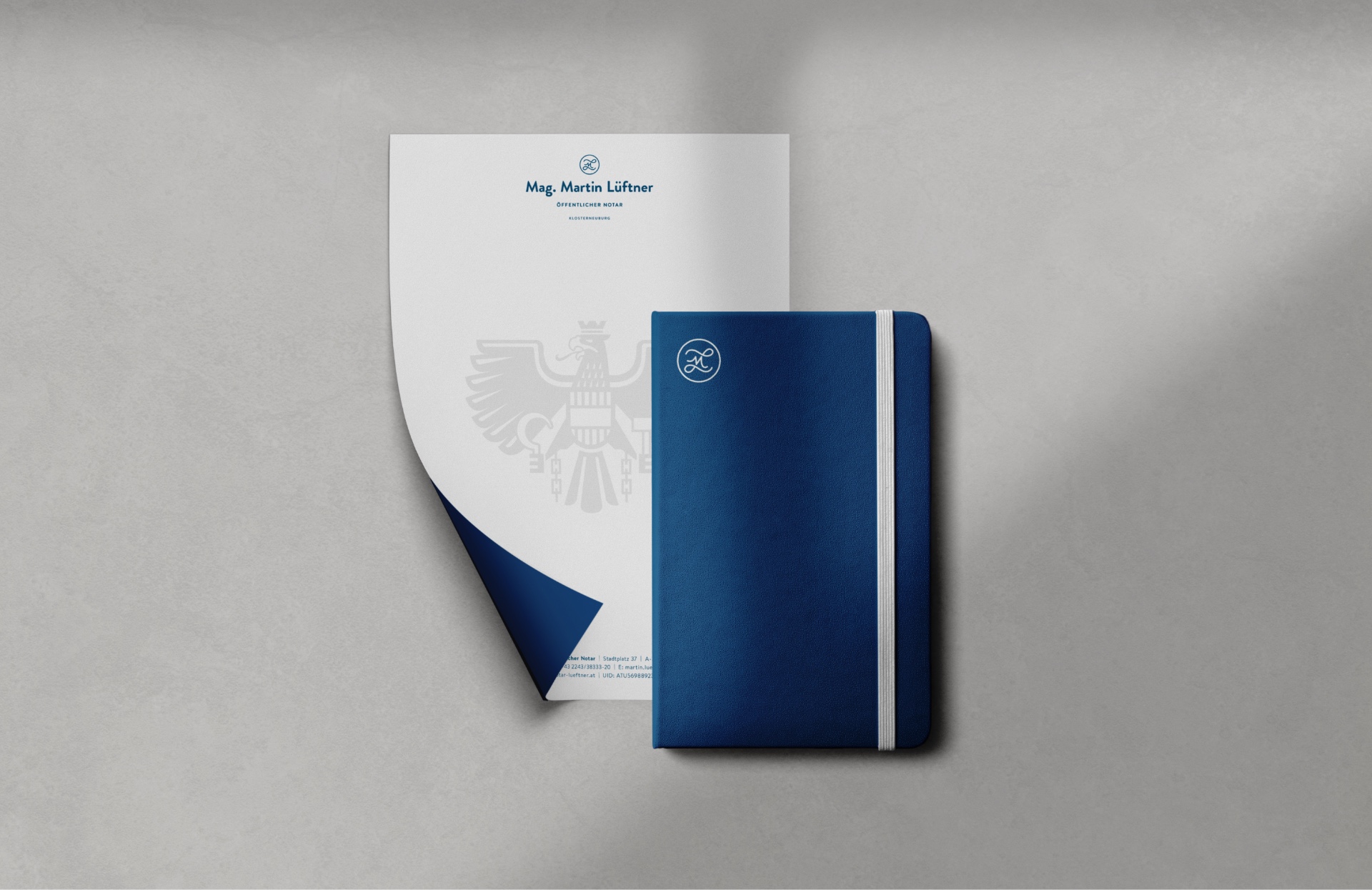
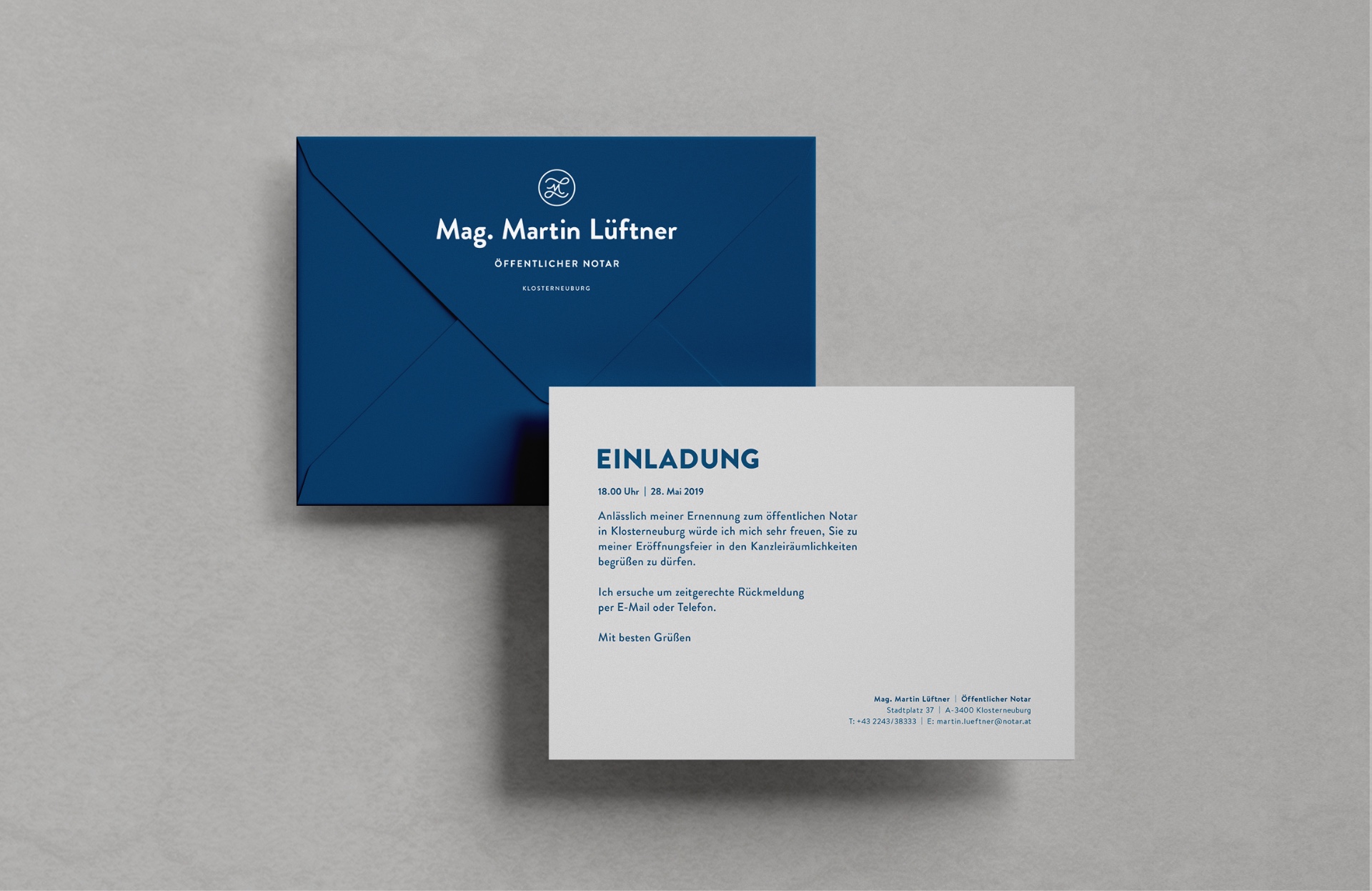
The palette remains understated: a cool, almost translucent light grey paired with a deep monochrome blue – calm, elegant, reserved. For typography, we chose Brandon Grotesque by Hannes von Döhren – a geometric sans serif inspired by the letterforms of the 1920s and ’30s, yet perfectly at home in the now.
Tasks
Logo Design
Art Direction
Credits
